Introduction
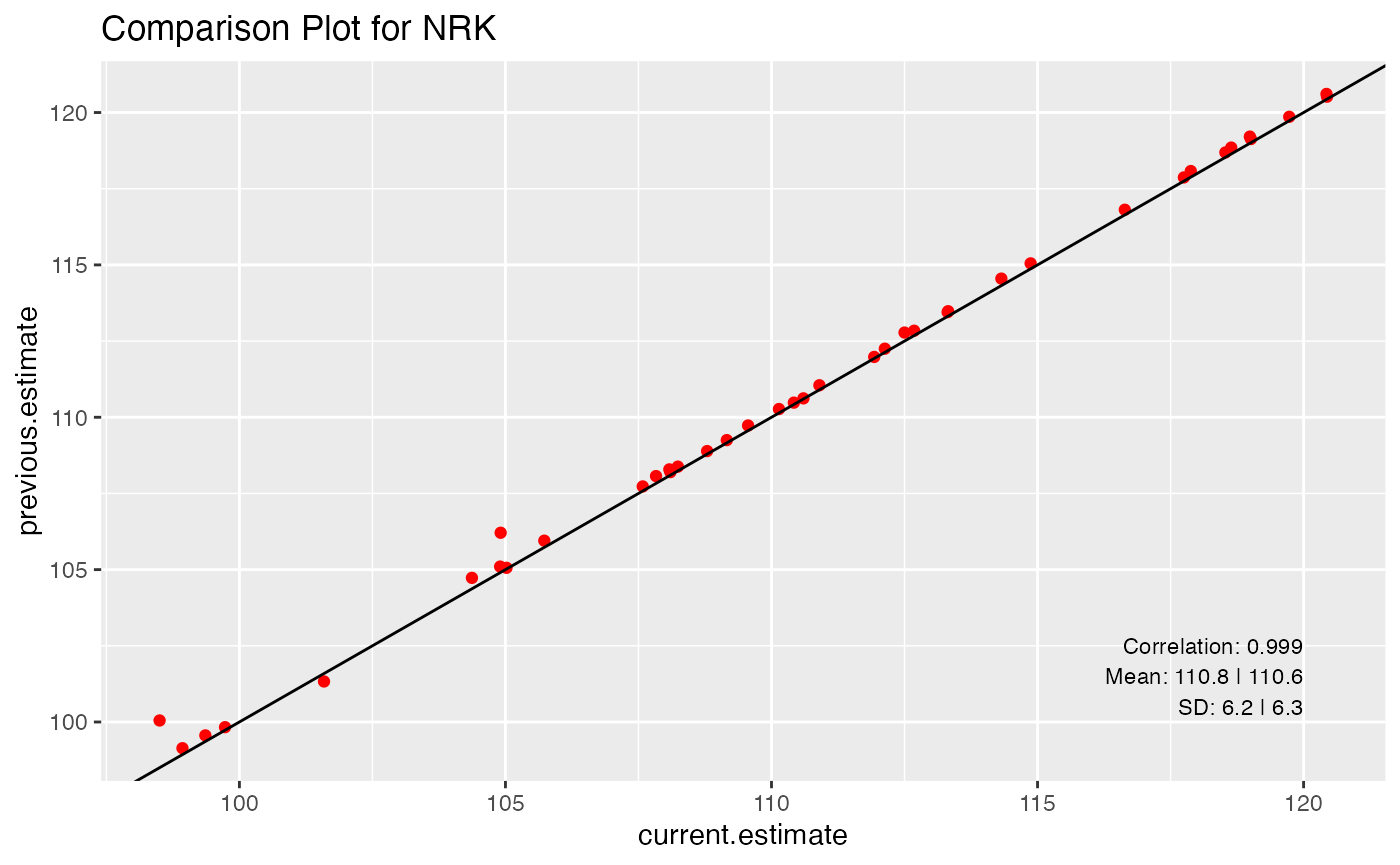
In a comparison plot, the result of two subsequent analysis are
compared by a scatter plot. In that plot the results of the current
analysis are on the x-axis and the results of the previous analysis are
on the y-axis. The resulting scatter plot should result in a cloud of
points that is close to the y = x line in the first
plotting quadrant. Any outlier point can give hints about potential
problems in the analysis.
For a single routine analysis the comparison plots by itself might only be meaningful with a lot of expert knowledge. When showing the comparison plots of two subsequent analyses next to each other, it might be much easier to get an idea about the quality of the current routine analysis.
Comparison Plot
The creation of a single comparison plot is already implemented. The
implementation uses a shell script
(stdfmtprogs/prog/compare.sh) to prepare the data that are
then shown in the comparison scatter plot. This script is called with
specific input parameter for each evaluation via a specific wrapper
script.
Although, the functionality is already available for creating the single plots, it might still be interesting to give a short outline about how a comparison plot is constructed. In principle, a comparison plot just needs two pieces of input. These consist of the two result files from the two subsequent analyses for which we want to compare the evaluation results. The basic ideas are shown with two small example datasets.
s_current_result_path <- system.file("extdata", "current_results.txt", package = 'qgert')
s_previous_result_path <- system.file("extdata", "previous_results.txt", package = 'qgert')
In a first step the two datasets must be read
library(dplyr)
tbl_current_result <- readr::read_delim(file = s_current_result_path, delim = ' ')
tbl_current_result <- tbl_current_result %>%
  dplyr::rename(current.estimate = estimate)
# tbl_current_result
The previous results
tbl_previous_result <- readr::read_delim(file = s_previous_result_path, delim = ' ')
tbl_previous_result <- tbl_previous_result %>%
  dplyr::rename(previous.estimate = estimate)
# tbl_previous_result
The quantity that is plotted can be found in the column entitled
estimate. For each of the traits different plots should be
produced.
The data from the two tibbles are joined to be used for the plotting afterwards
tbl_plot_result <- tbl_current_result %>%
  inner_join(tbl_previous_result, by = c("idaItb16" = "idaItb16", "trait" = "trait"))
# tbl_plot_result
For a single trait, we get
This can now be used to do a scatter plot
n_cor_current_prev <- cor(tbl_plot_nrk$previous.estimate, tbl_plot_nrk$current.estimate)
n_mean_previous <- mean(tbl_plot_nrk$previous.estimate)
n_sd_previous <- sd(tbl_plot_nrk$previous.estimate)
n_mean_current <- mean(tbl_plot_nrk$current.estimate)
n_sd_current <- sd(tbl_plot_nrk$current.estimate)
xrng <- range(tbl_plot_nrk$current.estimate)
x_pos_txt <- floor(xrng[2])
yrng <- range(tbl_plot_nrk$previous.estimate)
y_pos_txt <- ceiling(yrng[1]) + 0.5
library(ggplot2)
tbl_plot_nrk %>%
  ggplot(aes(x=current.estimate, y=previous.estimate)) +
  geom_point(color = 'red') +
  geom_abline(slope = 1, intercept = 0) +
  ggtitle(label = "Comparison Plot for NRK") +
  geom_text(aes(x, y, label = paste0('Correlation: ', round(n_cor_current_prev, digits = 3))),
                data = data.frame(x = x_pos_txt, y = y_pos_txt + 2), hjust = 1, size = 3) +
  geom_text(aes(x, y, label = paste0('Mean: ', round(n_mean_previous, digits = 1), ' | ', round(n_mean_current, digits = 1))),
                data = data.frame(x = x_pos_txt, y = y_pos_txt + 1), hjust = 1, size = 3) +
  geom_text(aes(x, y, label = paste0('SD: ', round(n_sd_previous, digits = 1), ' | ', round(n_sd_current, digits = 1))),
                data = data.frame(x = x_pos_txt, y = y_pos_txt), hjust = 1, size = 3)
These comparison plots are done for all traits that are in a result file. In general, a comparison plot requires as input the following components
- two datasets, one from the previous routine run and one from the current run.
- the join variables for the two data sets that define how the two datasets are to be joined and
- the filter criterion which defines what goes into one plot.
Drill Down Functionality
The points that are away from the y=x line are
interesting in the sense that they can point to a potential problem in
the evaluation. Hence it would be very interesting to have a drill-down
functionality to select the points on the plot and to get more
information about the data that is behind the given point.
One possible implementation of such a drill-down functionality is via the linked-brushing feature in a shiny app.